Statistical Volatility°: Finding the Active Hours
Use the Statistical Volatility° Graph Pane to find the most active hours of your market, read heatmap and histogram, and filter displacements by session.
Not every hour of the trading day is worth your attention. Many traders call the busiest windows "killzones": the stretches around session opens, overlaps and scheduled news where price tends to move the most. The Graph Pane of Statistical Volatility° (StatVol°) shows you which hours those are for the market on your chart, so you can plan your trading day around them instead of guessing.
Update: this guide reflects StatVol° v4. Earlier versions drew a fixed 50% midline in the graph. That line is gone. The Graph Pane now has optional reference lines and its own Volatility Filter, which can hide the quieter times of the day so only the most active ones remain.
What the Graph Pane shows
The Graph Pane sits below your chart and shows the typical volatility for each time of the day, or for each day of the week. It is a profile of when the market usually moves, not a forecast of what the next bar will do.
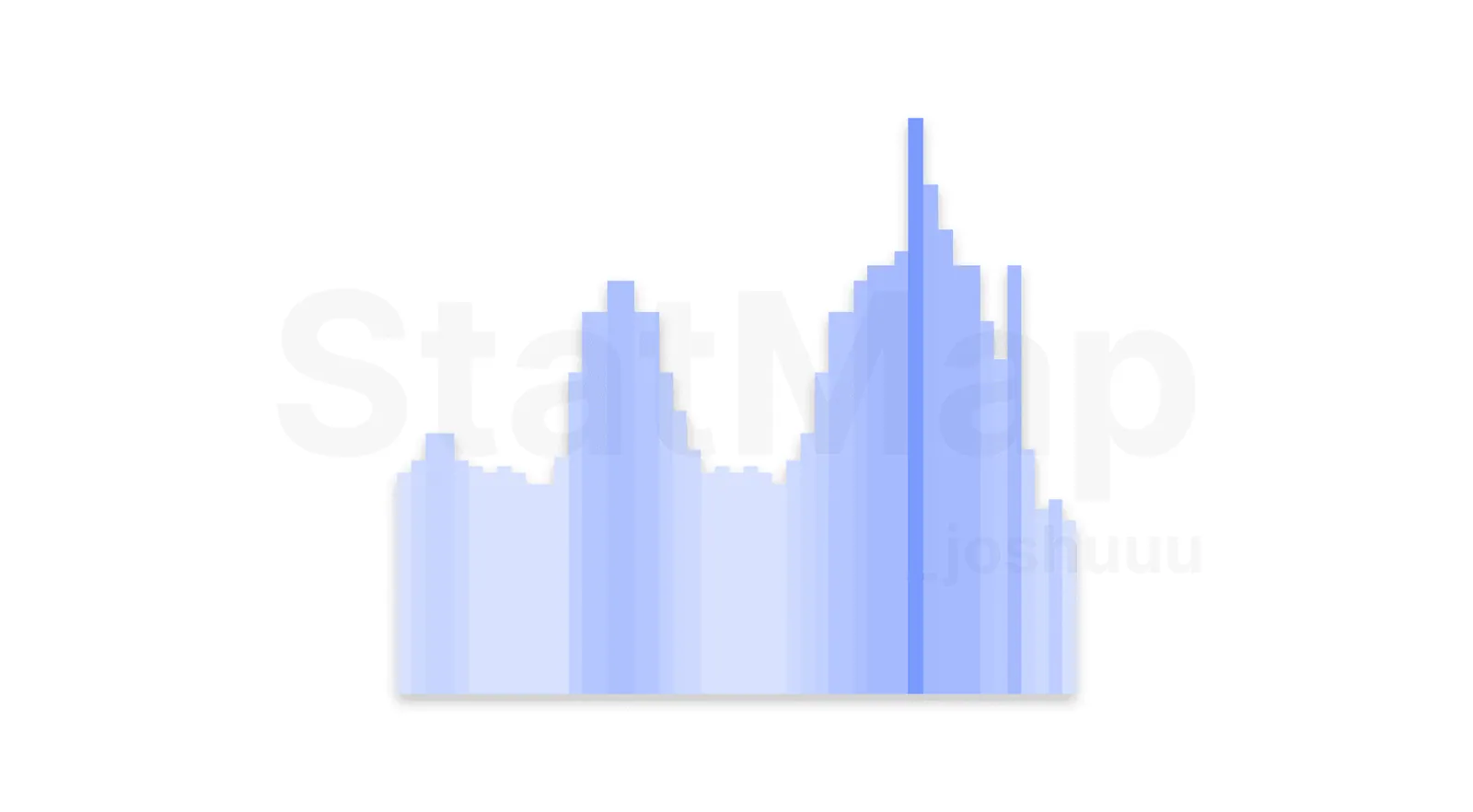
You can choose between two styles:
- Heatmap (default): colored cells for each time slot, by default from yellow for quiet slots to red for the most active ones. Good for spotting patterns at a glance.
- Histogram: bars whose heights compare the time slots with each other. Good for comparing one hour directly with another.
Reading the active hours
Look for the time slots that stand out, the hot cells in the heatmap or the tallest bars in the histogram. On index futures such as NQ these usually cluster around the session opens and scheduled data releases. On markets that trade around the clock, such as Bitcoin, the pattern looks different, which is exactly why it pays to check the graph for each market you trade.
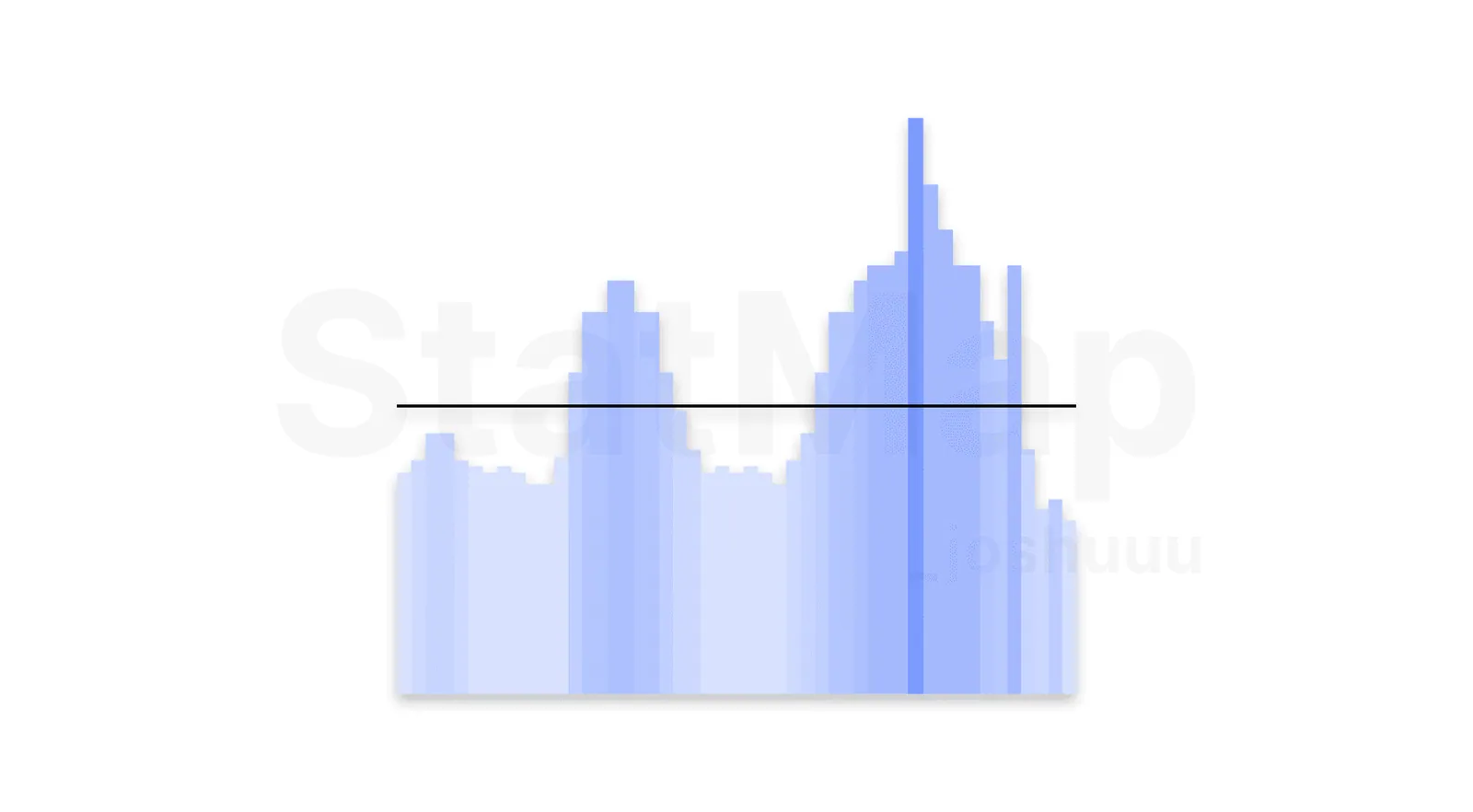
Three settings help you read the graph:
- Volatility Filter: Low shows every time slot. Medium (33%) and High (66%) hide the quieter slots compared with the most active one, so only the busiest hours remain. Custom lets you set your own percentage.
- Show Reference Lines (Histogram only): horizontal lines at 0.00, 0.33, 0.66 and 1.00 as a quick visual guide.
- Current Volatility Overlay (Histogram only): draws the current bar's volatility as a line, so you can see whether today is quieter or busier than usual at this time.
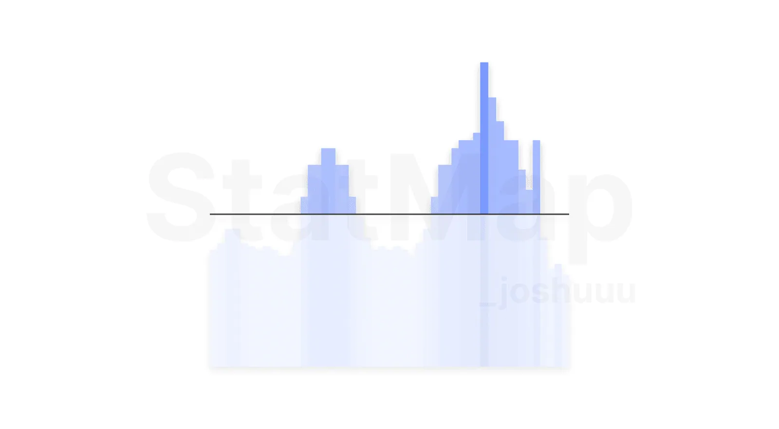
Putting the active hours to work
- Plan your session: note the two or three slots that stand out on your market and be at the screen for them.
- Filter displacements by time: the Time Filter in the Statistical Displacement settings accepts up to three sessions in HHMM-HHMM format (the defaults are 0200-0500, 0830-1100 and 1330-1600 New York time), so displacements outside your active hours are ignored.
- Separate the weekdays: the Day-of-Week Filter lets you leave out days you do not trade, for example weekends on crypto.
- Combine with levels: active hours tell you when a move is likely, Statistical Mapping° levels tell you where it may stop. The methods in Combining StatMap° and StatVol° build on exactly that.
For every option in the Graph Pane and displacement settings, see the StatMap° v4 Settings Reference. For the broader overview of the indicator, read What is Statistical Volatility?.
Put it on your chart
Get Statistical Mapping° and Statistical Volatility° for TradingView, or ask StatMap AI about settings and setup.
Related articles
What is Statistical Mapping?
Statistical Mapping° projects five levels from each period's open to show where highs and lows tend to form. Learn the levels, sessions and liquidity.
What is Statistical Volatility?
Statistical Volatility° highlights unusually large candles as displacements and shows the most active times of day in its Graph Pane.
Difference Between Mean and Median in Trading Context
See how Mean and Median differ with a simple NQ example, why news outliers skew the average, and when to pick Mean, Median or Both in Statistical Mapping°.