OHLC/OLHC – The Foundation of Price Action
OHLC and OLHC describe the order in which a candle forms its open, high, low and close. Learn how this sequence helps you read price action.
In trading, understanding how price moves throughout a session is crucial for making informed decisions. A key tool that helps traders visualize these movements is the OHLC (Open, High, Low, Close) chart, also known as OLHC. Whether you’re new to trading or looking to refine your strategy, grasping the basics of OHLC can significantly enhance your ability to interpret market behavior.
What is OHLC?
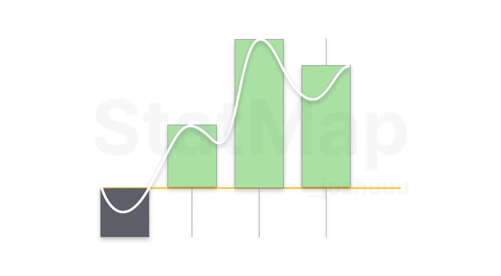
OHLC represents four critical points in the life of a trading session:
1. Open: This is the price at which the market or asset begins trading at the start of the session.
2. High: The highest price reached during the session.
3. Low: The lowest price reached during the session.
4. Close: The price at which the session ends.
These four points are plotted on a candlestick chart, where the open and close determine the body of the candlestick, and the high and low are represented by the wicks or shadows extending above and below the body.
Why OHLC/OLHC Matters
The OHLC structure gives you an in-depth look at how price fluctuates over time and reveals essential patterns:
1. Price Volatility: The distance between the high and low points of a candle shows how volatile the market was during the session. Long wicks often indicate indecision or price rejection at certain levels, providing valuable insights into potential reversals or continuations.
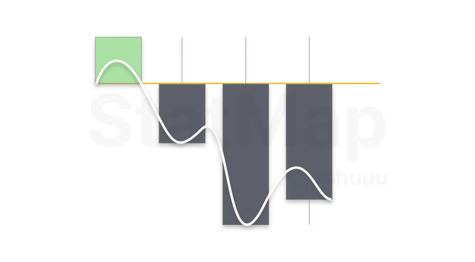
2. Market Sentiment: By looking at whether the close was higher or lower than the open, traders can assess whether the market was bullish or bearish during the session. When several bullish or bearish candles appear in a row, it suggests a strong trend.
3. Orderblocks: OHLC candles help identify potential orderblock candidates. The opening price of candles is often a sensitive price level, especially on candles with large bodies (open to close).
Taking OHLC to the Next Level with Statistical Mapping
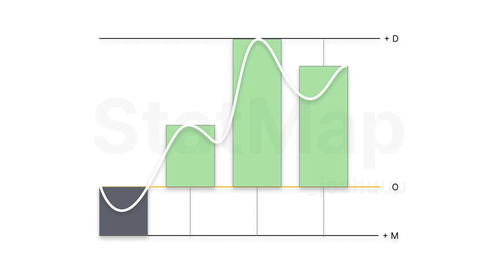
While OHLC gives a solid foundation of price action, combining it with Statistical Mapping° offers even deeper insights. Our indicator shows average price levels where manipulation and distribution happen, aligning these moves with price action can help you anticipate key moments during a trading session.
For example, while an OHLC candle tells you where price opened, closed, and the extremes it reached, our Statistical Mapping indicator helps you see the average price levels at which these turning points are likely to occur. You can anticipate when a session is nearing a reversal, or when the market is primed to continue its trend based on historical patterns. The phases behind these levels are explained in Accumulation, Manipulation, and Distribution.
Put it on your chart
Get Statistical Mapping° and Statistical Volatility° for TradingView, or ask StatMap AI about settings and setup.
Related articles
Fair Value Gaps
Learn how the three-candle Fair Value Gap forms, how bullish and bearish FVGs act as support and resistance, and when they flip into inversion FVGs.
Understanding the Breaker/Unicorn Setup
Learn how the breaker block captures liquidity before a reversal and how a Fair Value Gap inside it creates the higher probability Unicorn setup.
Understanding Accumulation, Manipulation, and Distribution in Trading
Understand the accumulation, manipulation and distribution phases of the Power of Three and how Statistical Mapping° levels help you anticipate each phase.